
matplotlib
matplotlib基本使用汇总
简介
- Matplotlib是Python的一个模块,是一个绘图库。
- 官方网址
import matplotlib |
输入类型
- 所有绘图函数都接收np.array或np.ma.masked_array作为输入。
%matplotlib inline
- 如果使用Jupyter Notebook,命令%matplotlib inline确保图形将被描绘在文档内部而不是独立窗口
pyplot.plt()
使用
plt.plot(x, y, format_string,[label,color,alpha=1,linestyle,linewidth], **kwargs)- x : X轴数据,列表或数组,可选
- y : Y轴数据,列表或数组
- format_string: 控制曲线的格式字符串,可选
- **kwargs : 第二组或更多(x,y,format_string)
- 当绘制多条曲线时,各条曲线的x不能省略
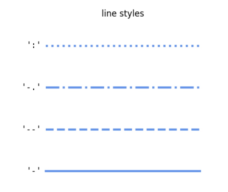
format_string线型风格字符
linestyle
| 线型风格字符 | 说明 |
|---|---|
| ‘-’ | solid line style (实线) |
| ‘–’ | dashed line style (虚线) |
| ‘-.’ | dash-dot line style (点划线) |
| ‘:’ | dotted line style (点线) |
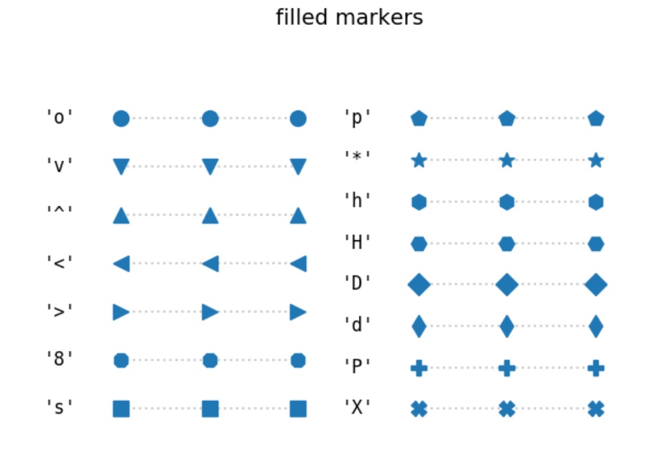
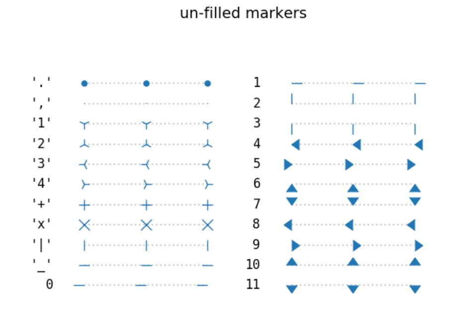
marker标记字符
| 标记字符 | 说明 |
|---|---|
| ‘.’ | point marker |
| ‘,’ | pixel marker |
| ‘o’ | circle marker |
| ‘v’ | triangle_down marker |
| ‘^’ | triangle_up marker |
| ‘<’ | triangle_left marker |
| ‘>’ | triangle_right marker |
| ‘1’ | tri_down marker |
| ‘2’ | tri_up marker |
| ‘3’ | tri_left marker |
| ‘4’ | tri_right marker |
| ‘s’ | square marker |
| ‘p’ | pentagon marker |
| ‘*’ | star marker |
| ‘h’ | hexagon1 marker |
| ‘H’ | hexagon2 marker |
| ‘+’ | plus marker |
| ‘x’ | x marker |
| ‘D’ | diamond marker |
| ‘d’ | thin_diamond marker |
| ‘|’ | vline marker |
颜色字符
| 颜色字符 | 说明 |
|---|---|
| ‘b’ | blue (蓝色) |
| ‘g’ | green (绿色) |
| ‘r’ | red (红色) |
| ‘c’ | cyan (青绿色) |
| ‘m’ | magenta (洋红色) |
| ‘y’ | yellow (黄色) |
| ‘k’ | black (黑色) |
| ‘w’ | 白色 |
| ‘#008000’ | RGB某颜色 |
| ‘0.8’ | 灰度值字符串 |
- 风格字符、标记字符和颜色字符可以组合使用
轴标签
- ylabel和xlabel
celsius_values = [25.6, 24.1, 26.7, 28.3, 27.5, 30.5, 32.8, 33.1] |
轴的范围
- axis查看和定义轴的范围
celsius_min = [19.6, 24.1, 26.7, 28.3, 27.5, 30.5, 32.8, 33.1] |
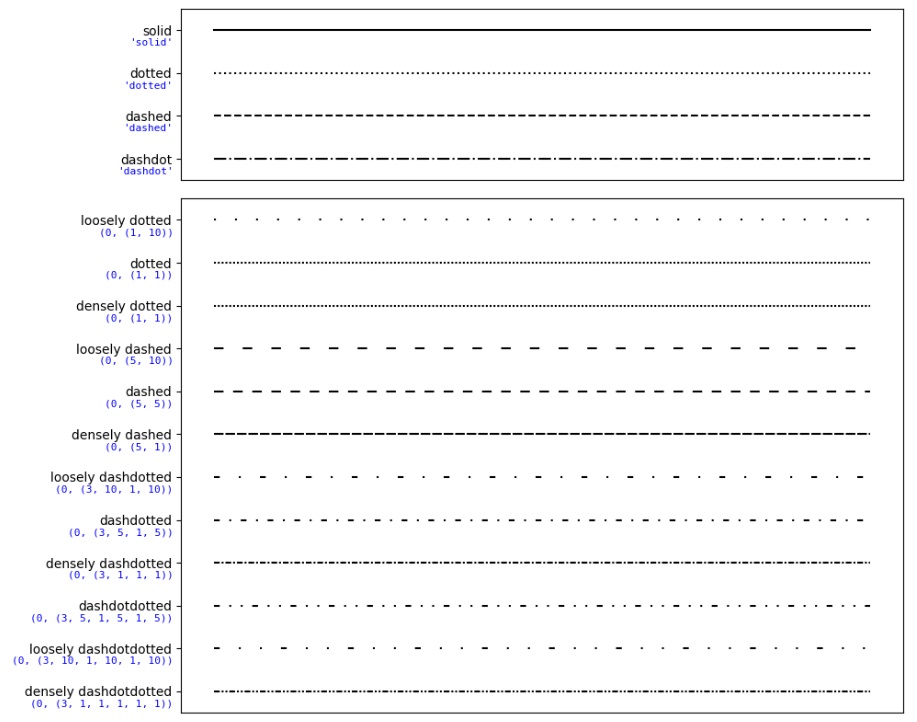
线型风格
linestyle可以设置更多的线型风格
X = np.linspace(0, 2 * np.pi, 50, endpoint=True) |
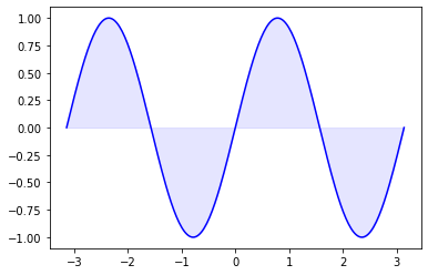
区域着色
-
fill_between(x, y1, y2=0, where=None, interpolate=False, **kwargs)xx数据的N长度数组y1y数据的N长度数组(或标量)y2y数据的N长度数组(或标量)where如果是None,则默认在所有位置之间填充。 如果不是None,则它是一个N长度的numpy布尔数组,并且填充只会在where == True的区域上发生。interpolate如果为True,则在两条线之间进行插值以找到精确的交点。 否则,填充区域的起点和终点将仅出现在x数组中的显式值上。kwargs传递给PolyCollection
n = 256 |
Spines
-
matplotlib中的Spine是连接轴刻度标记并指示数据区域边界的线。
-
设置坐标轴位置,plt.gca()返回figure上的当前的axes实例。
X = np.linspace(-2 * np.pi, 2 * np.pi, 70, endpoint=True) |
坐标轴刻度
- 使用xticks或yticks可获取或设置当前的刻度位置和标签
ax = plt.gca() |
- 调整刻度标签
for xtick in ax.get_xticklabels(): |
添加图例
- 图例(Legend)常在地图中使用。 Legend用来描述地图的图形语言或符号系统。
legend(*args, **kwargs)Matplotlib可以使用图例来解释图中函数或值的代表的含义。
x = np.linspace(0, 25, 1000);y1 = np.sin(x);y2 = np.cos(x); |
- 在许多情况下,我们不知道在plot之前结果可能是什么样子。 例如,legend将使线条的重要部分蒙上阴影。 如果不知道数据的显示情况,最好使用’best’作为loc的参数。 Matplotlib将自动尝试为图例找到最佳位置
plt.legend(loc='best') |
标题
pyplot.title(label, fontdict=None, loc=None, pad=None, **kwargs)
plt.title('Change of Celsius Degrees', size=11) |
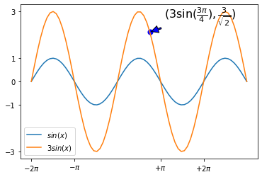
标注
annotate(label,xy,xytext,textcoords,fontsize,arrowprops)用于标出某一点在图中的位置- xy: coordinates of the arrow tip
- xytext: coordinates of the text location
| xycoords字符串值 | 坐标系统 |
|---|---|
| ‘figure points’ | Points from the lower left of the figure |
| ‘figure pixels’ | Pixels from the lower left of the figure |
| ‘figure fraction’ | Fraction of figure from lower left |
| ‘axes points’ | Points from lower left corner of axes |
| ‘axes pixels’ | Pixels from lower left corner of axes |
| ‘axes fraction’ | Fraction of axes from lower left |
| ‘data’ | Use the coordinate system of the object being annotated (default) |
| ‘polar’ | (theta, r) if not native ‘data’ coordinates |
| arrowprops key | 描述 |
|---|---|
| width | The width of the arrow in points |
| headwidth | The width of the base of the arrow head in points |
| headlength | The length of the arrow head in points |
| shrink | Fraction of total length to shrink from both ends |
| **kwargs | any key for matplotlib.patches.Polygon, e.g., facecolor |
X = np.linspace(-2 * np.pi, 3 * np.pi, 70, endpoint=True) |
网格线
plt.grid(color='b', alpha=0.5, linestyle='dashed', linewidth=1.0) |
中文字体
-
Matplotlib默认是不支持显示中文字符的,可以使用 rc 配置(rcParams)来自定义图形的各种默认属性。
-
Windows操作系统支持的中文字体和代码:
| 字体 | 代码 |
|---|---|
| 黑体 | SimHei |
| 仿宋 | FangSong |
| 楷体 | KaiTi |
| 微软雅黑 | Microsoft YaHei |
| 宋体 | SimSun |
| 隶书 | LiSu |
| 幼圆 | YouYuan |
| 华文细黑 | STXihei |
| 华文楷体 | STKaiti |
| 华文宋体 | STSong |
| 华文中宋 | STZhongsong |
| 华文仿宋 | STFangsong |
| 方正舒体 | FZShuTi |
| 方正姚体 | FZYaoti |
| 华文彩云 | STCaiyun |
| 华文琥珀 | STHupo |
| 华文隶书 | STLiti |
| 华文行楷 | STXingkai |
| 华文新魏 | STXinwei |
- 配置方法:
plt.rcParams['font.family'] = ['sans-serif'] plt.rcParams['font.sans-serif'] = ['SimHei']
# 全局设置:在jupyter notebook 中,设置下面两行来显示中文 |
保存图形
fig.savefig("filename.png")
fig = plt.figure() |
加载图形
import matplotlib.image as mpimg |
高质量svg矢量图输出
-
Jupyter Notebook中显示svg矢量图的设置: %config InlineBackend.figure_format = ‘svg’
-
保存svg矢量图
%config InlineBackend.figure_format = 'svg' |
面向对象的API绘图
- Matplotlib绘图库的操作是通过API实现的,一种操作方法是类似MATLAB的函数接口的API;另一种操作方法是面向对象的API。这两种API可以并行使用,不过函数接口的API的易用性明显好于面向对象的API。
# --------------面向对象------------------ |
使用实例对象绘制图中图
fig = plt.figure() |
设定绘图范围
set_ylim和set_xlim:配置轴的范围可以通过在轴对象中使用set_ylim和set_xlim方法来完成- 使用axis(‘tight’),可以自动创建"tightly fitted" 的轴范围:
fig, axes = plt.subplots(1, 3, figsize=(10, 4)) |
Logarithmic Scale对数尺度
set_xscale和set_yscale- 可以为一个或两个轴设置对数尺度,默认是线型尺度
- 使用接受一个参数(值为log)的set_xscale和set_yscale方法分别设置每个轴的scale
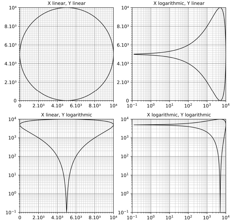
fig = plt.figure() |
多子图
subplot
subplot(nrows, ncols, plot_number)nrows * ncols个子轴- 参数plot_number标识函数调用创建的subplot。 plot_number的范围可以从1到最大nrows * ncols。
- 如果三个参数的值小于10,则可以使用一个int参数调用函数subplot,其中百位数表示nrows,十位数表示ncols,个位数表示plot_number。 这意味着:可以写subplot(234)来代替subplot(2, 3, 4) 。
plt.figure(figsize=(6, 4)) |
add_subplot()面向对象的方法
fig = plt.figure(figsize=(6, 4)) |
import matplotlib.pyplot as plt |
gridspec
- GridSpec类。 它可以替代subplot来指定要创建的子图的几何布局。 GridSpec背后的基本思想是“grid”。 一个grid(网格)有多个行和列。 必须在此之后定义一个subplot应该跨越多少网格。
import matplotlib.pyplot as plt |
- 精细化设置
figsize(float, float): optional, default: None- width, height in inches. If not provided, defaults to rcParams[“figure.figsize”] (default: [6.4, 4.8]) = [6.4, 4.8].
import matplotlib.gridspec as gridspec |
更多图形种类
- 详细使用案例可以参考官网
条形图
import matplotlib.pyplot as plt |
- 分组条形图
labels = ['G1', 'G2', 'G3', 'G4', 'G5'] |
- 堆叠条形图
import matplotlib.pyplot as plt |
饼图
import matplotlib.pyplot as plt |
| 参数 | 说明 |
|---|---|
| x | (每一块)的比例,如果sum(x) > 1会使用sum(x)归一化; |
| labels | (每一块)饼图外侧显示的说明文字; |
| explode | (每一块)离开中心距离; |
| startangle | 起始绘制角度,默认图是从x轴正方向逆时针画起,如设定=90则从y轴正方向画起; |
| shadow | 在饼图下面画一个阴影。默认值:False,即不画阴影; |
| labeldistance | label标记的绘制位置,相对于半径的比例,默认值为1.1, 如<1则绘制在饼图内侧; |
| autopct | 控制饼图内百分比设置,可以使用format字符串或者format function;’%1.1f’指小数点前后位数(没有用空格补齐); |
| pctdistance | 类似于labeldistance,指定autopct的位置刻度,默认值为0.6; |
| radius | 控制饼图半径,默认值为1;counterclock :指定指针方向;布尔值,可选参数,默认为:True,即逆时针。将值改为False即可改为顺时针。 |
| wedgeprops | 字典类型,可选参数,默认值:None。参数字典传递给wedge对象用来画一个饼图。例如:wedgeprops={‘linewidth’:3}设置wedge线宽为3。 |
| textprops | 设置标签(labels)和比例文字的格式;字典类型,可选参数,默认值为:None。传递给text对象的字典参数。 |
| center | 浮点类型的列表,可选参数,默认值:(0,0)。图标中心位置。 |
| frame | 布尔类型,可选参数,默认值:False。如果是true,绘制带有表的轴框架。 |
| rotatelabels | 布尔类型,可选参数,默认为:False。如果为True,旋转每个label到指定的角度。 |
- 甜甜圈图
my_circle = plt.Circle((0, 0), 0.7, color='white') |
- 嵌套饼图
labels = ['vegetable', 'fruit'] |
散点图
%matplotlib inline |
- 连接散点图
turnover = [30, 38, 26, 20, 21, 15, 8, 5, 3, 9, 25, 27] |
- 气泡图
nbclients = range(10, 494, 7) |
- 不同颜色的散点图
plt.scatter(x=range(40, 70, 1), |
直方图
%matplotlib inline |
等值线图
%matplotlib inline |
盒须图
%matplotlib inline |
棉棒图
%matplotlib inline |
极坐标图
import numpy as np |
雷达图
# Libraries |
极区图
import numpy as np |
维恩图
import matplotlib.pyplot as plt |
面状图
plt.figure(figsize=(6, 4)) |
树地图
import matplotlib.pyplot as plt |
词云图
- 需要安装wordcloud模块:pip install wordcloud
%matplotlib inline |
3D绘图
- 2D数据
import numpy as np |
- 散点图
import matplotlib.pyplot as plt |
- 3D平面
import matplotlib.pyplot as plt |
矩阵可视化
import matplotlib.pyplot as plt |
混淆矩阵
%matplotlib inline |
热图
import numpy as np |
图像显示
- 在Matplotlib中绘制图像的最常见方法是使用imshow()
- PIL(Python Imaging Library)是Python常用的图像处理库,而Pillow是PIL的一个友好Fork,提供了广泛的文件格式支持,强大的图像处理能力,主要包括图像储存、图像显示、格式转换以及基本的图像处理操作等
图像插值
- 插值方式分为:nearest bilinear bicubic
- 不同的插值方法将多个具有不同大小的图像相互层叠。 复杂的内插还意味着性能下降; 为了获得最佳性能或非常大的图像,建议使用插值interpolation=‘nearest’
将图像数据导入Numpy数组
img = mpimg.imread('cat.png') |
将numpy数组绘制为图像
imgplot = plt.imshow(img) |
使用PIL操作图像
from PIL import Image |
伪彩色
- 使用colormap根据灰度图生成彩色的图像
lum_img = img[:, :, 0] |
检查特定数据范围
plt.hist(lum_img.ravel(), bins=256, range=(0.0, 1.0), fc='k', ec='k') |
动画
ion
- 可以实时在画布显示绘图结果,但是刷新比较慢
plt.ion() |
animation
- 根据更新函数绘制动画,速度快
import matplotlib.pyplot as plt |